

Most founders doing $1M–$5M in D2C revenue already know their inventory is imprecise. They know because there’s a Slack message every few months about something running out. They know because there’s always one SKU sitting at 180 days of cover while something else goes critical. They know because the spreadsheet that “works” depends entirely on the one person who built it still being around.
What they usually don’t have is a clear picture of what good actually looks like – what inventory forecasting for D2C brands looks like when someone is consistently applying judgement to it, week in week out.
This post shows exactly that. Below is a sample weekly intelligence report in the format Inventory Loqiq delivers to clients every Monday. The brand shown – GlowLab Beauty Co. – is a fictional name used purely for illustration. This is a template example, not the data of any real client. The report structure, the methodology, the action framework: those are real.
Read through it. The format is the product.
⬇ Download the full sample report as PDF
The Report: GlowLab Beauty Co. – Weekly Inventory Intelligence
Cover & Contents
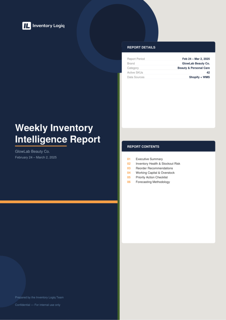
The cover sets the context: which brand, which week, which data sources. Every report opens with a contents list so the founder can jump to what’s most urgent. In practice, most clients read the executive summary and action checklist first, then refer back to the sections their ops coordinator or supplier needs to see.
Section 1: Executive Summary + Inventory Health
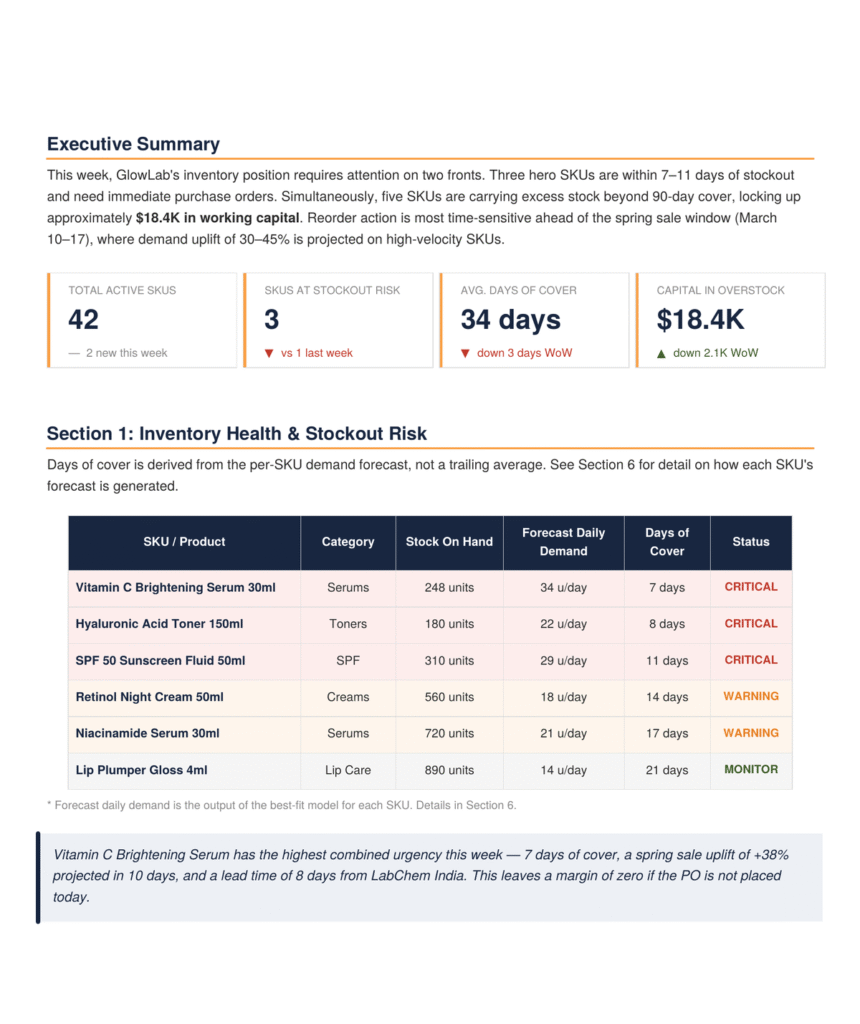
This is the first thing that lands on a Monday. Four numbers at the top – active SKU count, stockout risk count, average days of cover, capital locked in overstock – give an immediate read on the week’s shape before anyone reads a single row.
The table below it is where the actual calls get made. Days of cover here is not a trailing average – it’s derived from the per-SKU demand forecast for that cycle. A SKU with volatile promo-driven demand and a SKU with flat, stable velocity will show very different numbers even if their stock-on-hand looks similar. That distinction matters because the response is different: one needs a reorder today, the other needs a reorder by end of week.
Three SKUs are critical this week. The Vitamin C Brightening Serum has 7 days of cover against a supplier lead time of 8 days and a spring sale starting in 10. That’s not a warning – that’s a purchase order that should have gone out yesterday.
Section 2: Days of Cover Visualised + Reorder Recommendations
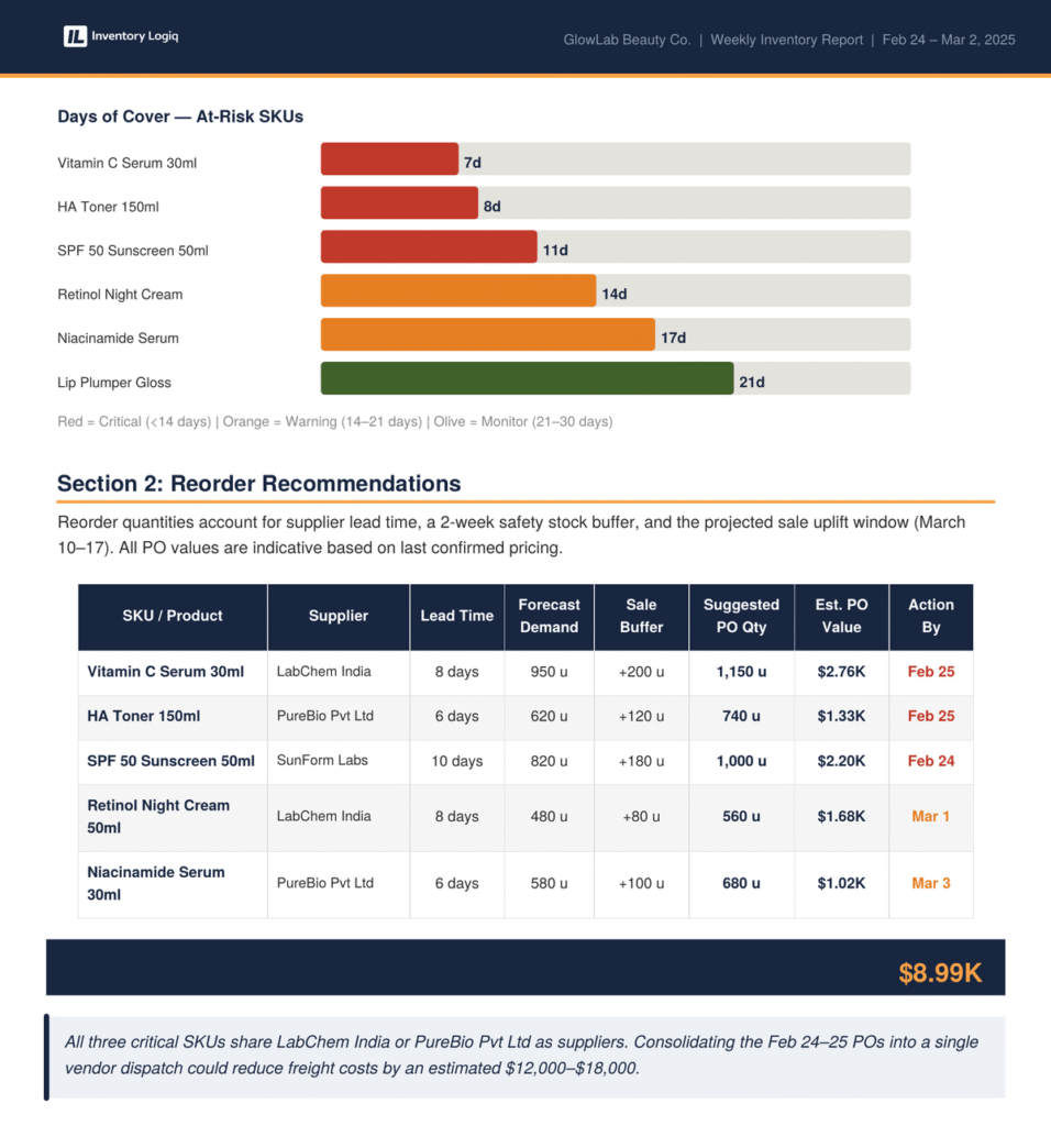
The bar chart makes the urgency visible at a glance – the three red bars are the ones that need action today. The reorder table below it gives the complete brief for whoever is placing the orders: which supplier, what quantity, why that quantity (base forecast plus sale buffer), and what it will cost.
The consolidation note at the bottom is the kind of observation that only appears if someone is actually looking at the data with context. Three critical SKUs share two suppliers. Combining those POs into a single dispatch saves an estimated $12,000–$18,000 in freight. That’s not something a dashboard surfaces automatically – it’s a judgement call that requires knowing the supplier relationships.
Section 3: Overstock Analysis + Priority Action Checklist
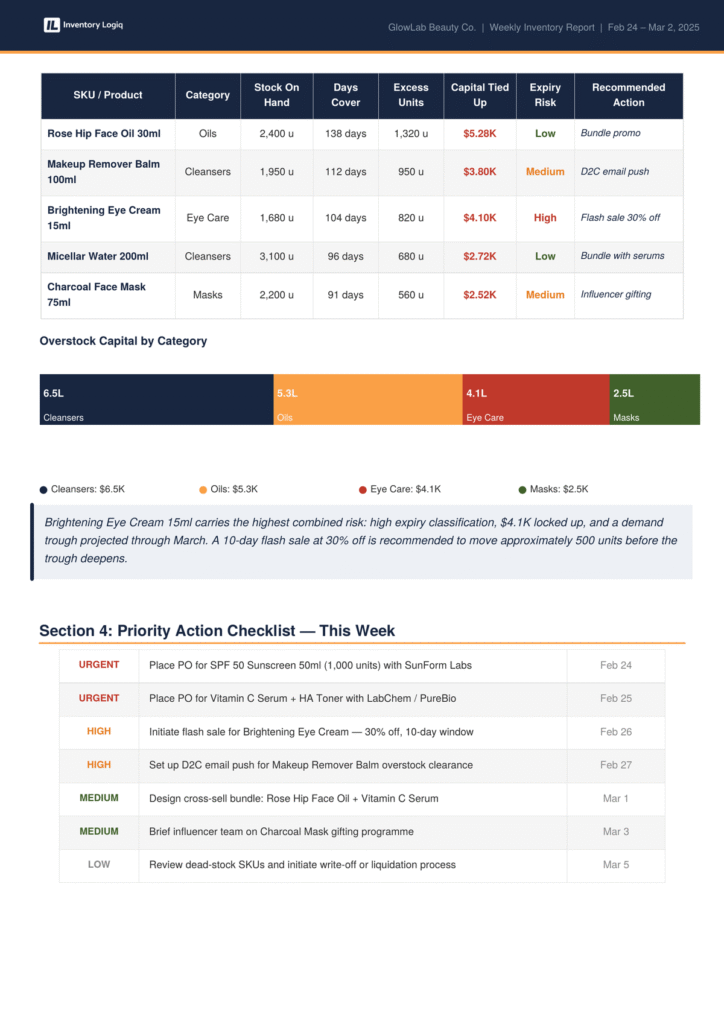
The overstock section is the one that tends to surprise founders. Stockouts feel urgent because customers tell you about them. Overstock is quiet – it just sits there, tying up working capital, accumulating expiry risk, and silently reducing your effective cash position.
Here, five SKUs are carrying more than 90 days of cover. The Brightening Eye Cream 15ml has the worst combination: $4.1K locked up, a high expiry risk rating, and a demand trough forecast through March. The recommendation is a 10-day flash sale at 30% off to move approximately 500 units before the trough deepens. That’s not generic advice – it’s specific to this SKU’s demand shape, its shelf life window, and the calendar.
The action checklist at the bottom is what actually gets used day-to-day. Two urgent items with dates, two high-priority items, two medium, one low. Everything has a deadline. The founder sends it to their ops coordinator and it runs.
Section 4: Forecasting Methodology
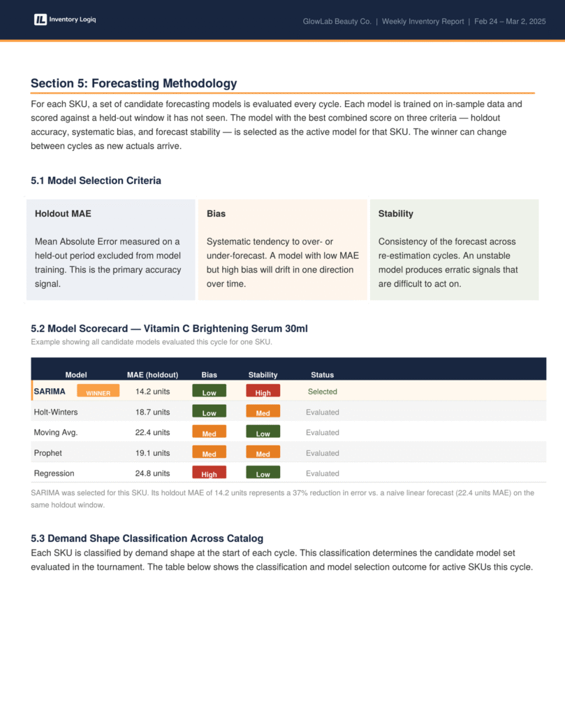
This section exists because founders should know how the numbers are produced. The approach is a model tournament: for each SKU, a set of candidate models is evaluated every cycle. Each model is trained on in-sample data and then scored against a held-out window of actual demand it hasn’t seen. The model with the best combined score across three criteria – holdout accuracy, systematic directional bias, and forecast stability – gets selected as the active model for that SKU for the coming week.
The scorecard shows this in practice for the Vitamin C Serum. SARIMA wins because it scores well on all three dimensions – a low error rate on the holdout window, low directional bias, and high stability across re-estimation cycles. The model that looks second-best on the accuracy metric alone (Holt-Winters) drops to second because its stability score is only medium. An unstable model produces erratic weekly signals, which makes it hard to plan around even if it occasionally produces a sharp forecast.
The metric used for accuracy is Mean Absolute Error on the held-out window, not the percentage-error variant used in most off-the-shelf tools. The percentage-based metric has a well-documented problem: it treats a missed forecast very differently depending on whether demand was high or low that period, which means it can reward models that systematically underpredict your best-selling SKUs. MAE avoids that distortion.
Section 5: Demand Shape Classification + Accuracy Across Catalog
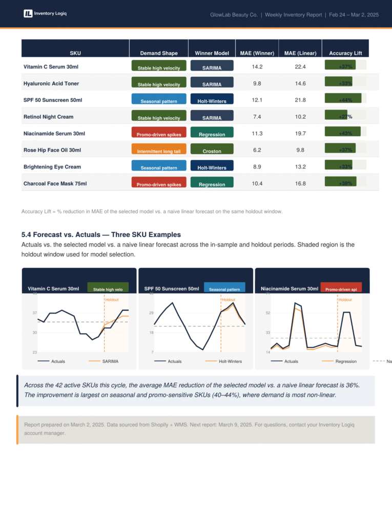
The demand shape classification is where the catalog gets segmented. Stable high-velocity SKUs go to SARIMA. Seasonal pattern SKUs go to Holt-Winters. Promo-sensitive SKUs go to regression. Intermittent long-tail SKUs get Croston’s method. The candidate set changes because the right model for a serum that sells 34 units per day consistently is not the right model for a face oil that occasionally sells 100 units and then nothing for three weeks.
The accuracy lift column shows the improvement over a naive linear forecast on the same holdout window. The range across the catalog is 27%–44%. The largest gains are on seasonal and promo-sensitive SKUs – the ones where a simple extrapolation gets most wrong. Those are also, not coincidentally, the SKUs where a bad forecast does the most damage: either a missed sale window or a significant overstock position heading into a slow period.
Every Catalog Has Quirks. The Report Accounts for Yours.
The sample above shows a clean example by necessity. In practice, the brands we work with have real-world variables that no off-the-shelf tool handles well – and that a static spreadsheet handles only until it doesn’t.
Lead times that aren’t actually fixed. Your supplier quotes 8 days. In March that’s accurate. In October, when they’re running three other brands’ festive production runs simultaneously, it’s closer to 14. The reorder trigger needs to reflect which one applies this week, not the number sitting in a master data field that nobody updated.
SKUs that behave differently by channel. Your hero serum moves at 34 units a day on D2C. On your retail partner’s platform it moves in bulk, irregularly, and the reorder logic is structurally different. Blending those two demand streams into a single forecast produces the wrong answer for both channels.
Marketing activity that isn’t in the data yet. You have an influencer post going live Thursday, or a paid campaign starting next week. That isn’t a historical pattern the model can learn – it’s a known event that needs to be factored in manually, and then normalised back out once the spike passes. A tool can’t do that. Someone has to.
Bundling and kitting that distorts component demand. When you run a gift set or a “buy 2 get 1,” the component SKUs consume inventory at a different rate for that window. A model trained on normal demand will systematically underestimate that consumption and leave you short on components right when the bundle is selling.
Seasonal SKUs with hard sell windows. A summer SPF or a festive gift set has a relevance expiry, not just a shelf-life expiry. Overstocking it late in the season isn’t just a working capital problem – it’s a write-off in waiting. The reorder logic needs to know when to stop ordering, not just when to order more.
Supplier minimums that change the economics of a decision. You need 400 units. The minimum order is 500. Is it worth carrying the extra 100 at this point in the season, given where demand is heading? That’s not a formula – it’s a call that requires knowing your sell-through rate, your storage cost, and your read on the next eight weeks.
None of these are edge cases. They’re just the texture of real operations at the 40–100 SKU scale. Standard SaaS tools either ignore these variables entirely or ask you to configure workarounds manually – which means someone on your team is still doing the judgement work, just without any structured support around it.
The report gets built around how your catalog actually behaves. The methodology stays consistent. The inputs reflect your reality.
What This Is and Isn’t
⬇ Download the full sample report – PDF
The report above is a sample template. GlowLab Beauty Co. is a fictional brand name used for illustration only. This represents the format and methodology we use – not the data of any specific client.
What the report demonstrates is the nature of the engagement. This is not a software subscription. There is no dashboard to learn, no seat licence, no onboarding session. What you receive is this report in your inbox every Monday, built on your Shopify and WMS data, with the models re-run against the previous week’s actuals.
The judgement embedded in the report – which SKU urgency combination requires same-day action, whether the overstock on a particular SKU warrants a sale or a bundle, whether two supplier POs should be consolidated – is not automated. It’s applied by a team that is looking at your catalog with context about your sales calendar, your supplier relationships, and your brand’s operating rhythm.
At the €1M–€5M scale, you are not going to hire a supply chain director to do this. And a SaaS demand planning tool will give you a number without explaining why it got there or whether you should act on it this week versus next week. The gap between those two options is exactly what this retainer fills.
What Working with Inventory Loqiq Looks Like
The engagement is a monthly retainer. You get a weekly report in this format, a shared channel where urgent items get flagged before they become crises, and a monthly call for catalog-level decisions – new SKUs to onboard, products being discontinued, supplier changes that affect lead times.
The brands we work with are typically doing €800K–€8M in D2C revenue across beauty, personal care, and lifestyle. The common thread is not size – it’s the point where manual inventory management starts costing more in stockouts, write-offs, and founder time than a structured retainer would.
If the report above looks like what your Monday mornings should feel like, that’s the conversation worth having.